Visualizing Your New House Color
(Color Matching - Part 3)
The summer before last, when Nancy was having our house repainted (this used to be something we did ourselves), the painter brought samples of her top three color choices and painted about a 1-foot by 2-foot patch of each on the front wall. Although that seemed an improvement over the 1-square-inch swatches in the little kit, we still had trouble determining if her favorite was going to be too dark when applied to the whole house. That's where Photoshop comes in. Here is an easy visualization technique based on the color matching lessons you've already learned (see Color Matching - Part 1).
- Grab your camera. First take as many pictures of your house as you need to evaluate the new paint. These are the pictures you are going to manipulate to see the new color. One or two pictures should suffice. The white balance for all of these pictures must be the same, and the same as the images taken in Step 2.
- Next take pictures of the paint patch. Each picture should have the new color in one half and the existing house color in the other half. Although you can get by with one picture, I'd recommend up to five. On manual mode, use any reasonable ISO and f-stop. It might even be better if these pictures weren't in focus. Adjust the shutter speed so the pictures are very bright, but not clipping or falling off the right side of your histogram. Take the shot. Adjust the shutter speed 11/2 to 2 f-stops (multiply the denominator (which is probably the only part showing) of your shutter speed by 3 or 4). Take another shot. Repeat until you near the left side of your histogram.
- Load your paint patch pictures into Photoshop. Use the Eyedropper Tool with the largest sample size that can be contained inside the paint patches to sample the old paint patch and the new, jotting down the RGB values of each sample from each picture. Below are sample values. You may now close these files.
| File Number | Shutter Speed | Existing Color | New Color | ||||
|---|---|---|---|---|---|---|---|
| Red | Green | Blue | Red | Green | Blue | ||
| *_1192.* | 1/10 | 197 | 198 | 165 | 185 | 186 | 150 |
| *_1193.* | 1/30 | 106 | 107 | 77 | 94 | 94 | 66 |
| *_1194.* | 1/90 | 47 | 47 | 31 | 41 | 41 | 25 |
| *_1195.* | 1/250 | 17 | 16 | 10 | 14 | 14 | 7 |
- Now open one of your house pictures. Make a Curves adjustment layer above the other layers.
- Go to the blue curve. If you took only one paint patch picture, you will handle it exactly as you did in Step 4 of "Color Matching - Part 1".
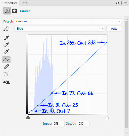
- For subsequent samples (optional), left click toward the top of the curve line (the diagonal line running from the lower left corner to the upper right corner of the histogram), making a little black square along the line. From your notes, enter the blue value for the next largest existing paint color (77 in our example) into the Input field and the blue value for the new color (66 in our example) into the Output field. Click and make another little black square a little further down the line and enter the next set of blue values. Continue until you have a square for each paint patch picture, as shown in the left illustration below. (You may have noticed that this resulting curve is not a straight line as one might expect. I don't yet have an explanation for that.)
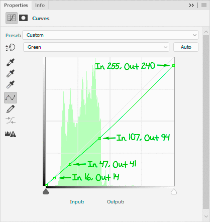
- Repeat Steps 5 & 6 for the green curve in the same Curves layer, as shown in the right illustration. Repeat again for the red layer (only the blue and green curves are shown below. The red is left as an exercise for the reader).


- Click on the layer with the house image. You must now mask off all of the areas of the house that will be covered with the new paint. This doesn't have to be your best mask. The Quick Selection Tool might work nicely, or else try the Polygonal Lasso Tool (since most walls have straight edges) or even the Magnetic Lasso Tool to select all of the painted areas, then click the "Add layer mask" button (black rectangle surrounding white circle at the bottom of the Layers area).
- Repeat Step 4 for the rest of your house pictures. If you drag the Curves layer to copy it from one image to the next, you can skip Steps 5 through 7, but then you need to replace the mask (Step 8).

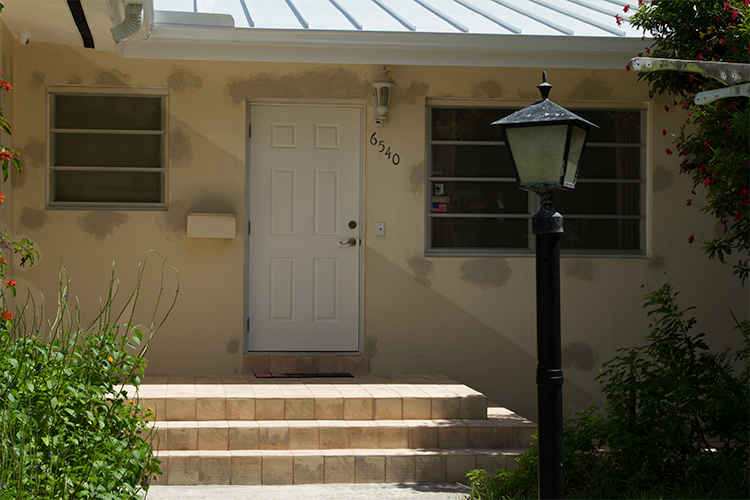
In the image above, the effect of the Curves layer and mask are visible in the lower left half of the wall. As an exercise, compare this to the small darker patches on the upper right part of the wall. This photo of the house wasn't made until after we had selected the color and the painters had already used it to patch a few areas. That's when we became concerned that it might be too dark and I came up with this idea. Don't compare that section of the wall to the darker patches in that same (masked) lower left part of the wall - where the same darker patches have been made even darker by the curves layer. Had we excluded them from the mask, they would have virtually disappeared.
We didn't think the new color was too dark after all, and decided to go for it. We are still happy with our decision.
You can contact us if you have any questions, or hit the Comment Button below if you have any suggestions for improvement.